SMODER Tutorial 03: Simulated Human Melanoma Result Visualization
This tutorial shows how to visualize inferred cell-type proportions for a simulated human melanoma dataset.
This tutorial starts from a precomputed dataset-specific SMODER output file:
spatial_decon_result.h5ad
The upstream SMODER run follows the same general idea as Tutorial 01: run SMODER on a dataset to produce a result file, then use the result file for downstream visualization. Here, we focus on the visualization step.
What is spatial_decon_result.h5ad?
In SMODER, each dataset produces its own result file, conventionally named:
spatial_decon_result.h5ad
The simulated human melanoma result file is different from the Mousebrain and HBC result files, even though the filename is the same.
For this dataset, the result file should contain:
adata.obsm["spatial"]
adata.obsm["cell_type_proportions"]
Load the SMODER result
from pathlib import Path
import scanpy as sc

spatial_result = Path("path/to/simulated_human_melanoma/spatial_decon_result.h5ad")
adata = sc.read_h5ad(spatial_result)

print(adata)
print(adata.obs.columns)
print(adata.obsm.keys())
Extract spatial coordinates and proportions
The spatial coordinates are stored in:
adata.obsm["spatial"]
The inferred cell-type proportions are stored in:
adata.obsm["cell_type_proportions"]
In this simulated dataset, the first four columns of adata.obs are metadata:
cell_count
region_id
dominant_cell_type
second_sampling
The remaining columns correspond to simulated cell-type names.
import numpy as np

coords = np.asarray(adata.obsm["spatial"])
x = coords[:, 0]
y = coords[:, 1]

proportion_matrix = np.asarray(adata.obsm["cell_type_proportions"])
cell_type_names = list(adata.obs.columns[4:])
Plot proportion heatmaps
For proportion heatmaps, a sequential colormap is useful because the values have a natural low-to-high ordering.
import matplotlib.pyplot as plt
import numpy as np

cmap = "YlOrRd"

for i, cell_type in enumerate(cell_type_names):
    values = proportion_matrix[:, i]

    vmax = np.quantile(values, 0.98)
    if vmax <= 0:
        vmax = values.max()
    if vmax <= 0:
        vmax = 1.0

    fig, ax = plt.subplots(figsize=(5, 5))
    sca = ax.scatter(
        x,
        y,
        c=values,
        cmap=cmap,
        vmin=0,
        vmax=vmax,
        s=18,
        edgecolors="none",
    )

    ax.set_title(cell_type)
    ax.set_aspect("equal")
    ax.set_xticks([])
    ax.set_yticks([])
    ax.invert_yaxis()

    fig.colorbar(sca, ax=ax, fraction=0.046, pad=0.04)
    fig.savefig(f"{cell_type}.png", dpi=300, bbox_inches="tight")
    plt.close(fig)
The same idea can be extended to a multi-panel figure by plotting each cell type in one subplot.
Complete plotting script
The repository provides a plotting script that implements this workflow:
scripts/plot_simulated_human_melanoma_results_for_docs.py
You can adapt the input path at the top of this script to your own SMODER result file.
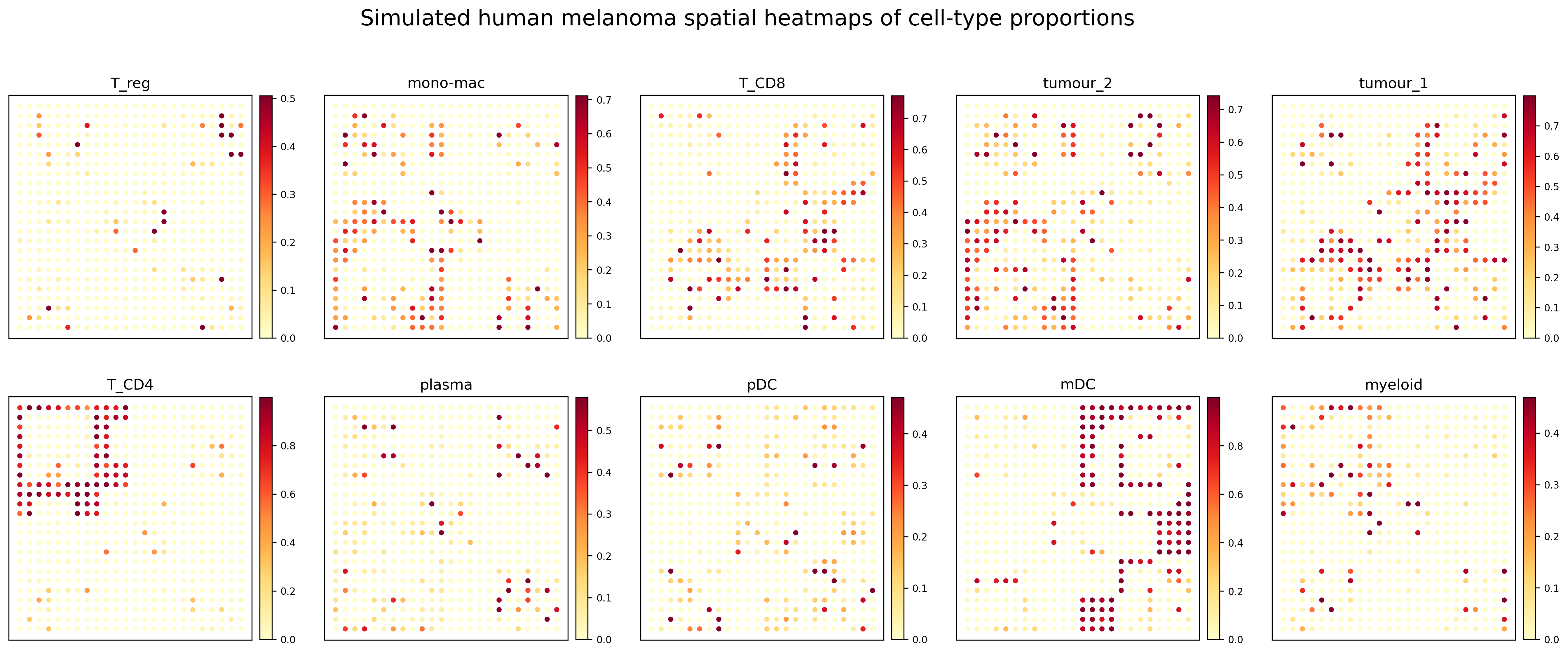
Representative results
All cell-type proportion heatmaps
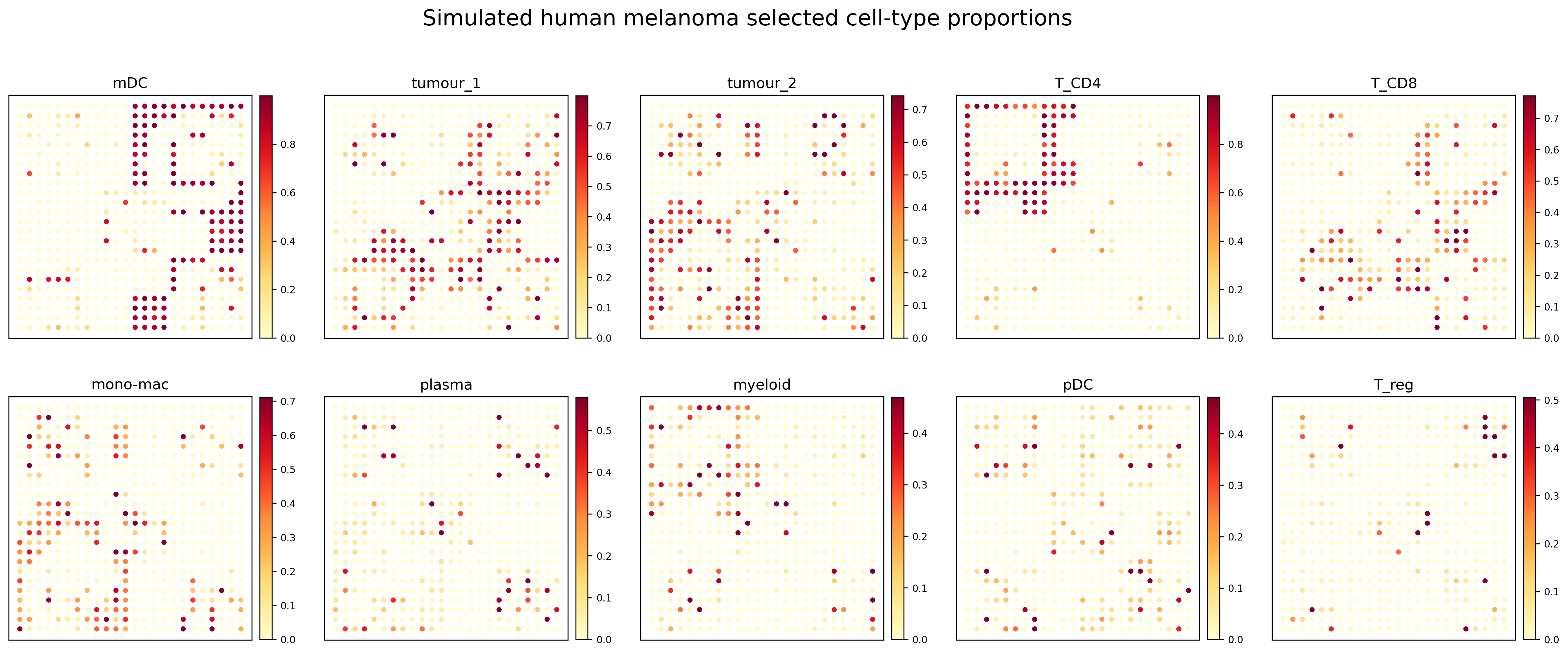
Compact proportion panel
Notes
The simulated dataset contains relatively sparse local hotspots for some cell types. Therefore, the plotting workflow uses a warm sequential colormap and a quantile-based upper color limit to make high-proportion regions more visually distinguishable.